Web Design for Japanese Users: 5 UX Preferences (JUX) to Know
 中山 凌波
中山 凌波
Web Design for Japanese Users: 5 UX Preferences (JUX) to Know
Foreign brands and global companies entering the Japanese market often face common challenges such as:
“The design looks sophisticated, yet the bounce rate is unexpectedly high.”
“There is traffic, but it does not lead to conversions.”
One major reason for these issues is the direct application of overseas-style UX (User Experience) designs without understanding the unique preferences and behavioral patterns of Japanese users.
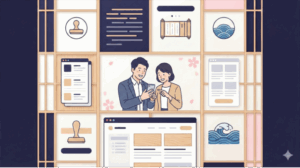
This has led to growing attention on the concept of “J-UX (Japanese UX)”—an approach to UX design optimized for the sensibilities of Japanese users.
In this article, we explain what J-UX is and outline five key characteristics of web design and content that resonate strongly with Japanese audiences.
Entered Japan but Not Selling? What Local-Perspective Marketing Is:

目次
- 1 What Is J-UX (Japanese UX)?
- 2 Five Key Characteristics of Web Design and UX Preferred by Japanese Users
- 2.1 1. Preference for Detailed yet Clear Information Structure
- 2.2 2. Buttons and Headings Should Avoid Overly Aggressive Language
- 2.3 3. Trust Must Be Clearly and Visibly Demonstrated
- 2.4 4. Design Should Emphasize a Sense of Security and Harmony
- 2.5 5. Align with the “Convince First, Act Later” User Mindset
- 3 Creating a Seamless Web Experience with J-UX
- 4 Conclusion: J-UX Is Essential for Success in the Japanese Market
What Is J-UX (Japanese UX)?
The Importance of UX Design Tailored to the Japanese Market
J-UX refers to UX (User Experience) design that is optimized based on the values, behavioral psychology, and visual preferences of Japanese users.
Compared to Western markets, Japanese users place greater importance on how information is presented, how trust is established, and the order in which actions are taken.
Ignoring these differences makes it difficult for even excellent products or services to achieve meaningful results.
In other words, J-UX is not simply about adjusting visual design—it is about designing experiences that align with Japan’s cultural context.
Five Key Characteristics of Web Design and UX Preferred by Japanese Users
1. Preference for Detailed yet Clear Information Structure
In Western markets, the “beauty of white space” is often emphasized.
In Japan, however, providing all necessary information clearly is closely associated with trust.
Japanese users feel reassured by the process of locating the information they seek. If too much information is omitted, it may create uncertainty or distrust.
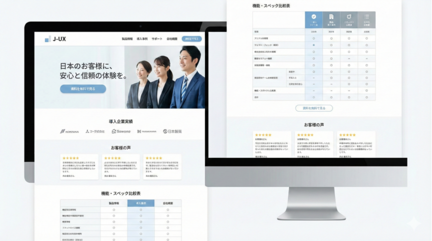
On product pages, it is important to present pricing, specifications, usage instructions, competitor comparisons, FAQs, and reviews in a step-by-step manner. Well-organized information, easy-to-read layouts, and clear content hierarchy are key factors in improving UX.
2. Buttons and Headings Should Avoid Overly Aggressive Language
In overseas markets, imperative expressions such as “BUY NOW” or “GET STARTED” are common. In Japan, however, such phrasing can feel pushy or intrusive.
Japanese users generally prefer a polite and understated tone. Softer expressions like “View the free materials” or “Learn more” tend to perform better.
The same applies to headings. Instead of strong claims like “Guaranteed Success!”, more restrained and specific phrasing such as “Three key points to achieving results” leaves a more positive impression.
Beyond design, choosing words that fit Japanese psychology matters too. See "Words That Resonate in Japan: A Guide to Cultural Translation."
3. Trust Must Be Clearly and Visibly Demonstrated
Japanese users place a particularly strong emphasis on third-party validation and proven track records.
It is therefore essential to clearly display elements such as customer reviews, lists of client companies, media coverage, expert commentary, and certification badges throughout the website.
Placing trust indicators near the first view or close to CTAs (Calls to Action) is especially effective in increasing reassurance and improving conversion rates.
4. Design Should Emphasize a Sense of Security and Harmony
While bold graphics and vivid colors are popular overseas, Japanese users tend to feel more comfortable with calm color schemes and orderly designs.
Clean layouts based on white or blue tones, highly readable fonts such as Noto Sans JP, and well-balanced grid systems form the foundation of effective design.
Rather than visual impact, designs that convey sincerity and reliability are more likely to influence purchasing decisions in Japan.
5. Align with the “Convince First, Act Later” User Mindset
Many Japanese users are process-oriented consumers who prefer to take action only after they are fully convinced.
Effective site structures often follow this flow:
・Empathy (presenting user challenges or concerns)
・Detailed information (clearly explaining features, pricing, and usage)
・Comparison (highlighting differences from competitors)
・Trust validation (reviews, case studies, and proof points)
・Call to action (purchase or inquiry)
By guiding users through this conviction process, websites can reduce bounce rates and naturally encourage action.
To apply these UX principles to real e-commerce, see "Win in Japan Without a Store: E-Commerce for Overseas Brands."
Creating a Seamless Web Experience with J-UX
Japanese users tend to disengage quickly when they sense even slight inconsistencies or unnatural expressions.
For this reason, it is essential to align not only visual design, but also wording, structure, and user flow with cultural expectations.
・User flows that allow information to be accessed with confidence
・Copywriting with a natural and respectful tone
・Design that visibly communicates trust and credibility
Rather than importing designs that work overseas as-is, success in Japan comes from recreating a sense of comfort and familiarity for Japanese users.

Digital Marketing in Japan for Foreign Companies: Strategy to Execution:
Conclusion: J-UX Is Essential for Success in the Japanese Market
The Japanese market is particularly nuanced, with strong cultural uniqueness in design preferences, language, trust-building, and purchasing psychology.
That is precisely why global brands must adopt UX design that aligns closely with Japanese sensibilities in order to achieve results.
By implementing J-UX, a website can evolve from a simple digital presence into a comfortable and trustworthy experience for Japanese users.
If you are planning to expand your website for the Japanese market, why not start incorporating the J-UX perspective today?